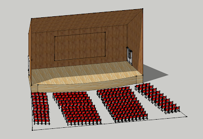
 My first rendering is of the SAC auditorium. There is a fashion show scheduled there in about 3 weeks, and I signed up as part of the design team. So I measured and mapped out the space, and now I can go back in and see how different elements will work, including sets, props, and projections.
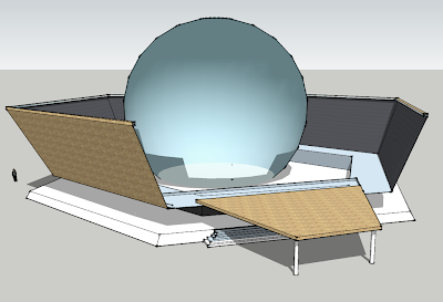
 This theatre space design has a translucent orb as the focus. The idea is for performance activity to happen within the sphere, but the orb itself would also be a place for projections. I like the idea that some of the media can be visible from outside the theatre, for a broader audience.
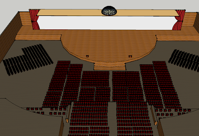
 The lesson from this design is that chairs are evil. Chairs are the only reason that I can come up with why this plan (and the first one) started to get impossibly slow for sketch up to run. I have a pretty decent machine, but working with so many chairs was very frustrating.
I like the idea of a panoramic vantage point along the stage - which opens up great potential for projections, and a different scale of immersion for the audience member.
Waiting for my sketch-up pro version to digitally arrive to me - let's see if at the least it can help me work with these elements quicker.
-Jose
No comments:
Post a Comment